Project Overview
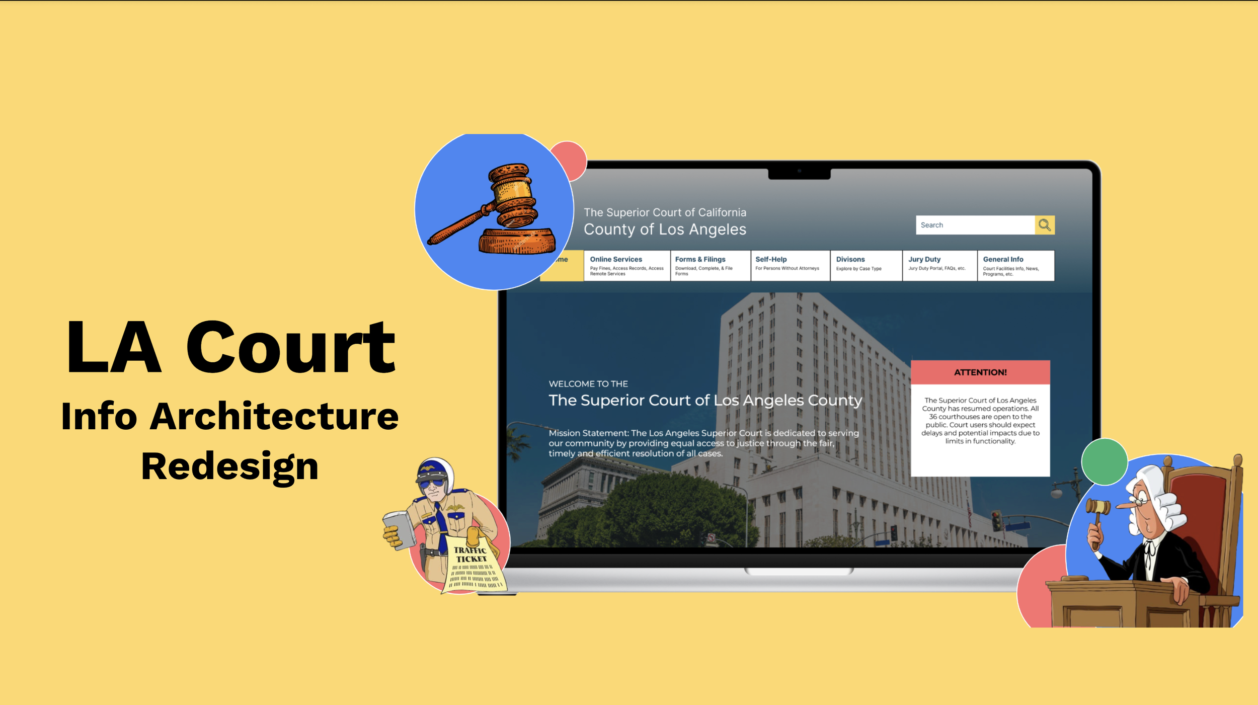
As part of an Information Architecture class within the Rutgers University Masters of Business and Science program, I collaborated with my team to analyze the Los Angeles Court website from an information architecture perspective and execute a comprehensive redesign. Through usability testing methods like first-click testing, tree testing, and more, we identified and addressed key pain points in the site’s navigation and labeling. Ultimately, the redesign led to faster task completion, higher success rates, and improved user confidence, though some areas still require further refinement.
Timeline: June 2024 - August 2024
Role: UXD/Product Designer
Tools: Optimal Workshop, Figma
Team Members: Kevin Tordella & Jonny Lin
Intro to LA Court
Redesigning for Impact
The Los Angeles Court website is the official website for The Superior Court of California, County of Los Angeles. The court system (and its corresponding website) serves over 10 million residents across 88 cities and 125 unincorporated areas. With 36 courthouses spread over 4,084 square miles, the court handles all types of cases, from minor traffic violations to serious criminal cases, impacting millions of lives daily.
Given the wide array and complexity of use cases as well as the wide range of users, our team believes that redesigning the LA Court site will help make essential legal resources and information more accessible to all users and improve the efficiency and overall effectiveness of the LA court system.
The Anatomy of the LA Court website
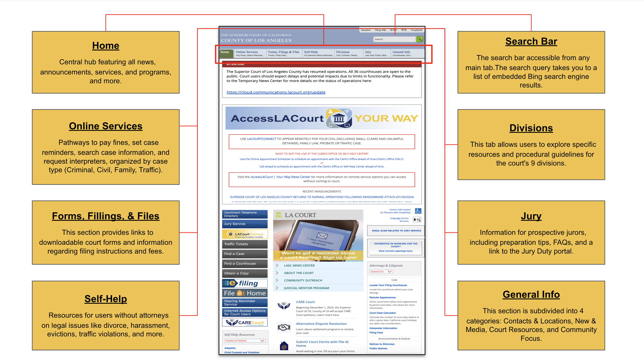
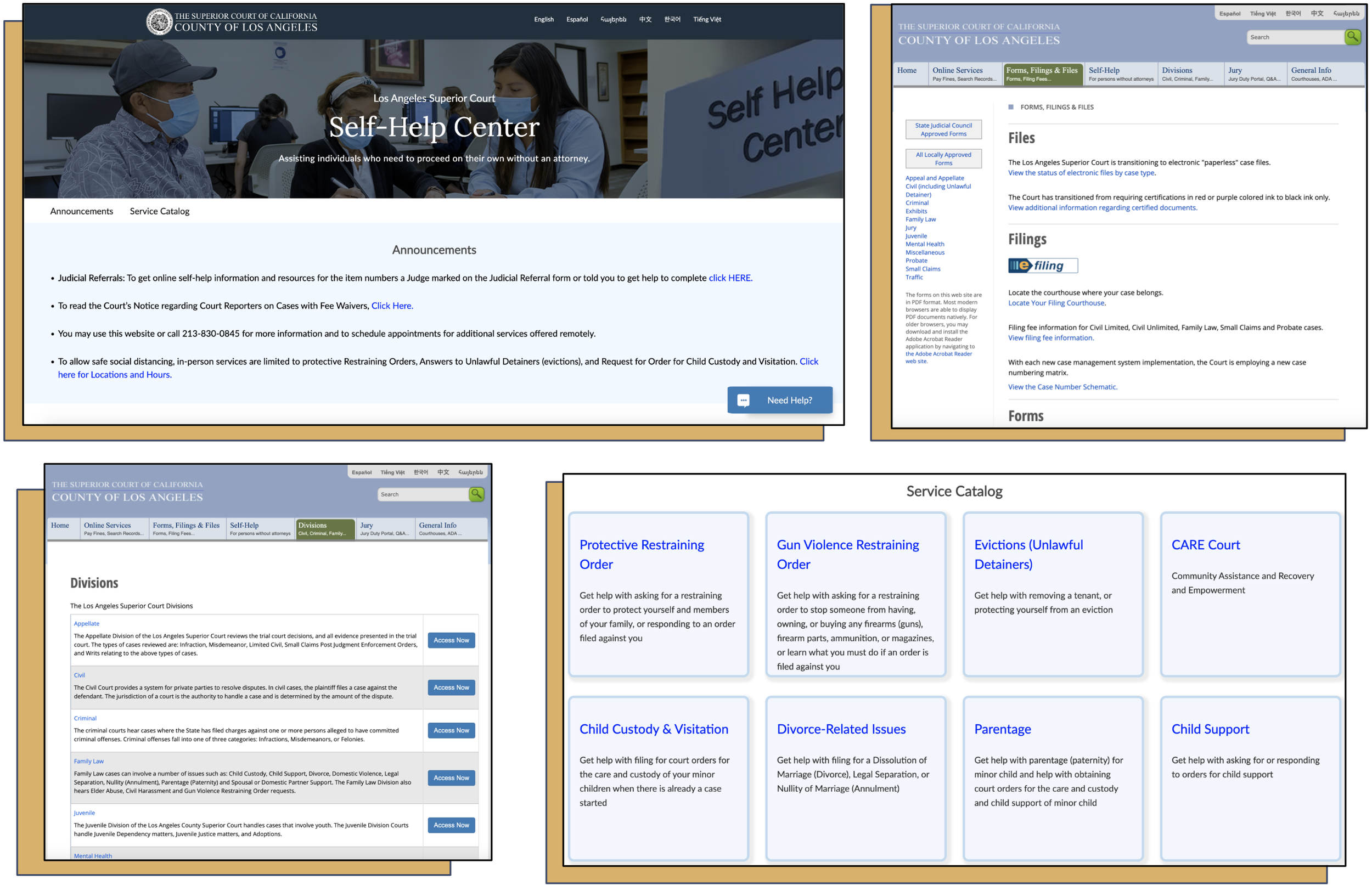
Information within the LA Court website is organized using 7 main categories:
Home
Online Services
Forms Filings & Files
Self-Help
Divisions
Jury
General Info
Each category contains sub-sections for more specific information, organized by law types, divisions, local vs. state forms, news and media, court resources, and community resources. Many links, such as “case search”, are cross-listed under multiple categories.
Problem Statement
How might we redesign the LA Court website to reduce information overload and help users quickly find the legal information they need?
User Personas
Empathizing with Our Users
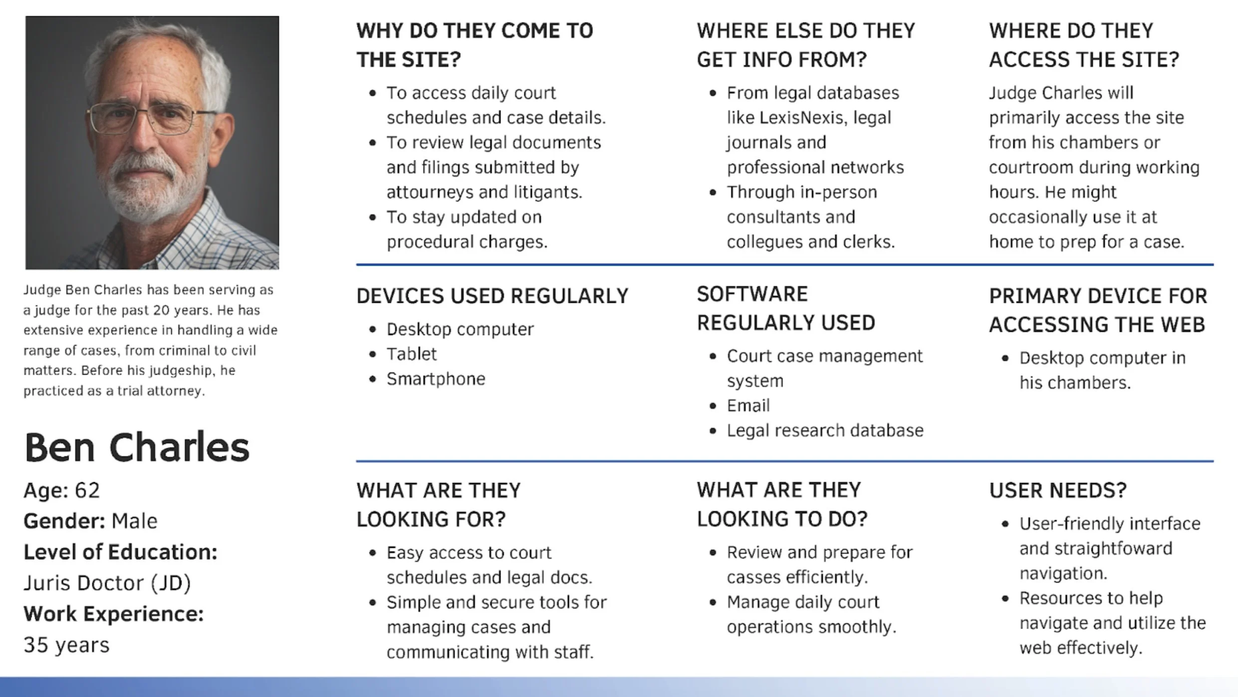
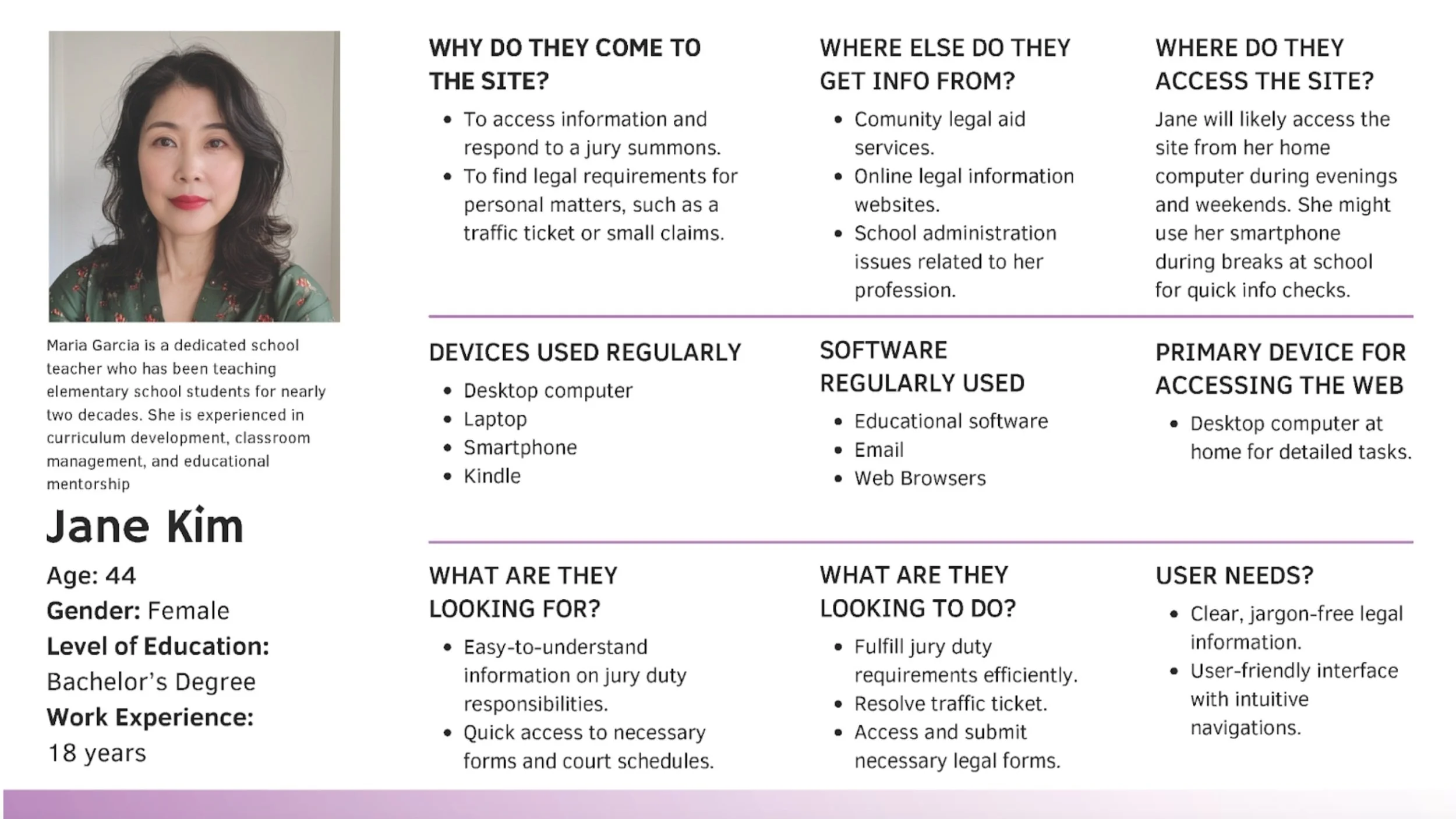
The LA Court website has a wide and diverse user base that includes litigants, attorneys, jurors, legal researchers, court employees, media professionals, and more. Developing user personas at this stage helped our team clearly define behaviors, goals, and challenges, guiding us in creating a more user-friendly, accessible, and efficient redesign.
Initial User Research & Analysis
Step 1: First-Click Testing
First Click Testing is a type of usability test that tracks where users first click on a webpage when trying to complete a specific task. Our team used this method for the LA Court website to evaluate how easily users can find specific information, identify navigation issues, and improve overall design to enhance user satisfaction and efficiency.
The first click test for the LA Court website was conducted online using Optimal Workshop. The test consisted of 5 pre-study questions, 10 tasks with confidence and difficulty ratings for each, and 4 post-study questions using a mix of Likert scale and open-ended formats. Overall, 9 participants successfully completed this test.
Key findings from the test include the following:
High Success Tasks:
Paying Traffic Tickets
Jury Duty Info
Family Law Resources
Courthouse Locations
Low Success Tasks:
Filing a Restraining Order
Appear in Court Remotely
User Feedback on Key Issues:
User dissatisfaction with the overall experience, with 44.4% rating it as neutral, 33.3% as poor, and only 11.1% as good.
Common complaints centered on the website’s cluttered & overwhelming layout
Step 2: Tree Testing
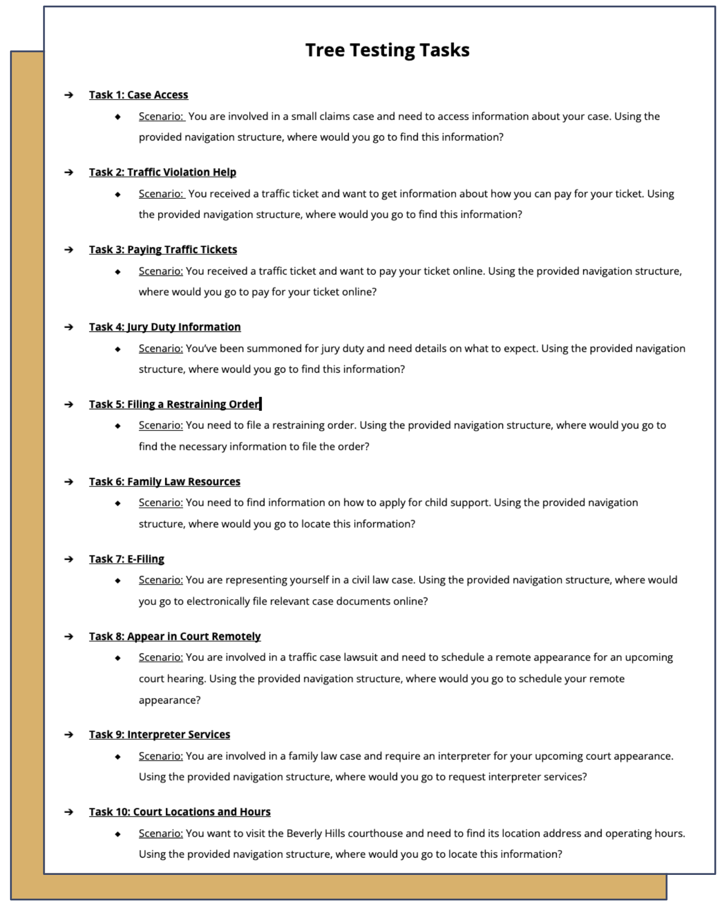
Tree Testing is a usability method that evaluates the structure and organization of a website by testing how users navigate through a text-based hierarchical model to find specific information. Our team used Tree Testing to assess the intuitiveness and effectiveness of the LA Court website's information architecture, without the influence of visual design. By tracking the paths users take to complete common tasks, we aimed to evaluate the clarity of the navigation structure and identify any areas where users might encounter difficulties.
Like the first click test, the tree test for the LA Court website was conducted online using Optimal Workshop.
The test consisted of 5 pre-study questions, 10 tasks with confidence and difficulty ratings for each, and 4 post-study questions using a mix of Likert scale and open-ended formats. Overall, 8 participants successfully completed this test.
Key findings from the test include the following:
High Success Tasks:
Paying Traffic Tickets
Family Law Resources
Courthouse Locations
Low Success Tasks:
Jury Duty Info
Traffic Violations Help
Filing Restraining Order
Interpreter Services
User Feedback on Key Issues:
Ambiguous categories & overly general tabs.
Cluttered interface with an excess of nested links
Overwhelming menus with too many terms
Step 3: Stress Testing
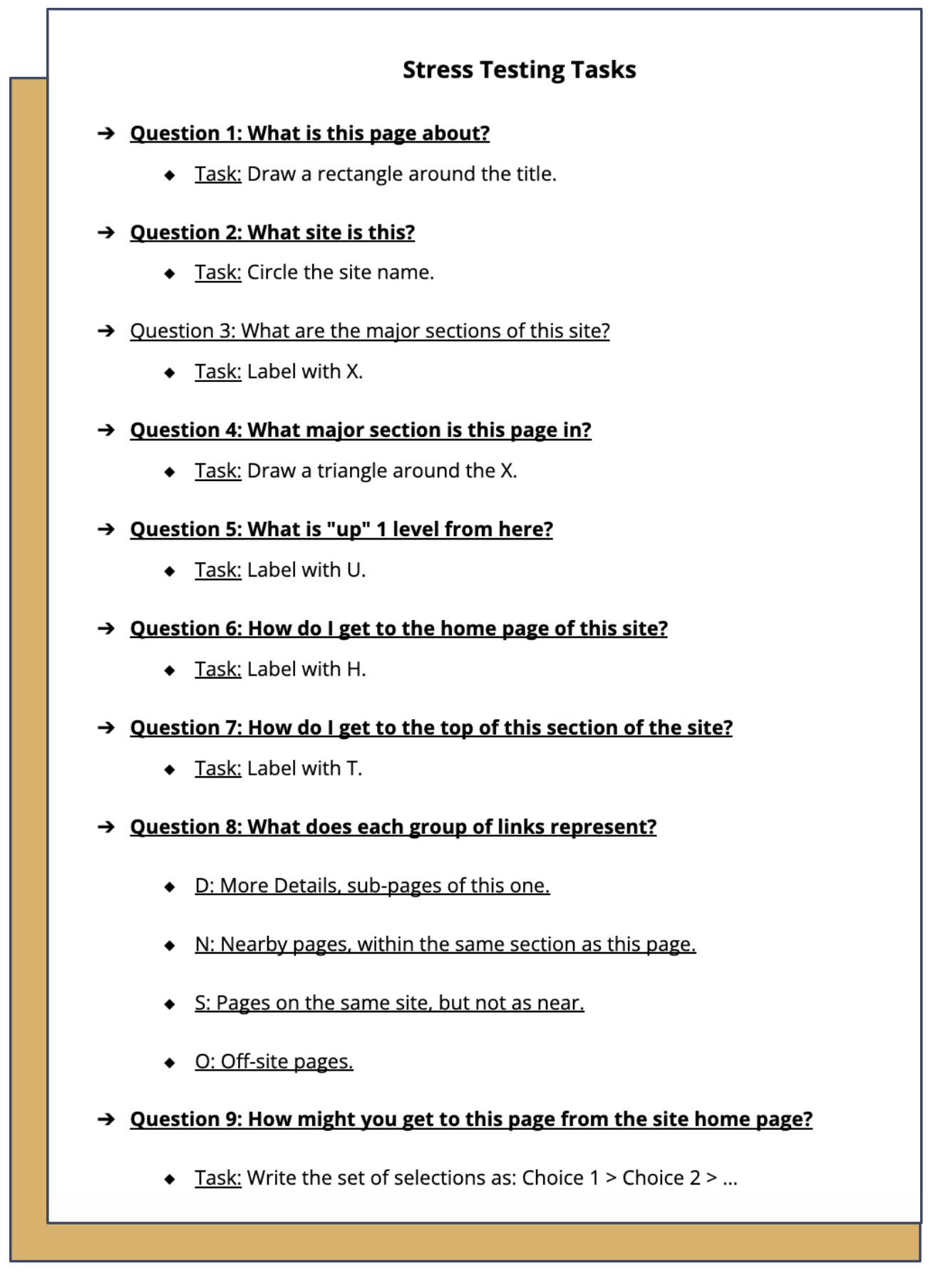
Stress Testing is a type of usability test that evaluates a website’s performance under extreme conditions, such as high user loads or complex scenarios, to identify weaknesses in the system. For our project, our team provided participants with a screenshot of the LA Court Jury page to assess how intuitively they can navigate and understand the site's structure with minimal information.
The test, which consisted of 9 tasks, was conducted remotely using Zoom. Overall, 5 participants completed this test.
Key findings from the test include the following:
High Success Tasks (100%):
What is this page about?
What site is this?
How do I get to the homepage of this site?
How do I get to the top of this section of the site?
Low Success Tasks (<50%):
What is "up" 1 level from here?
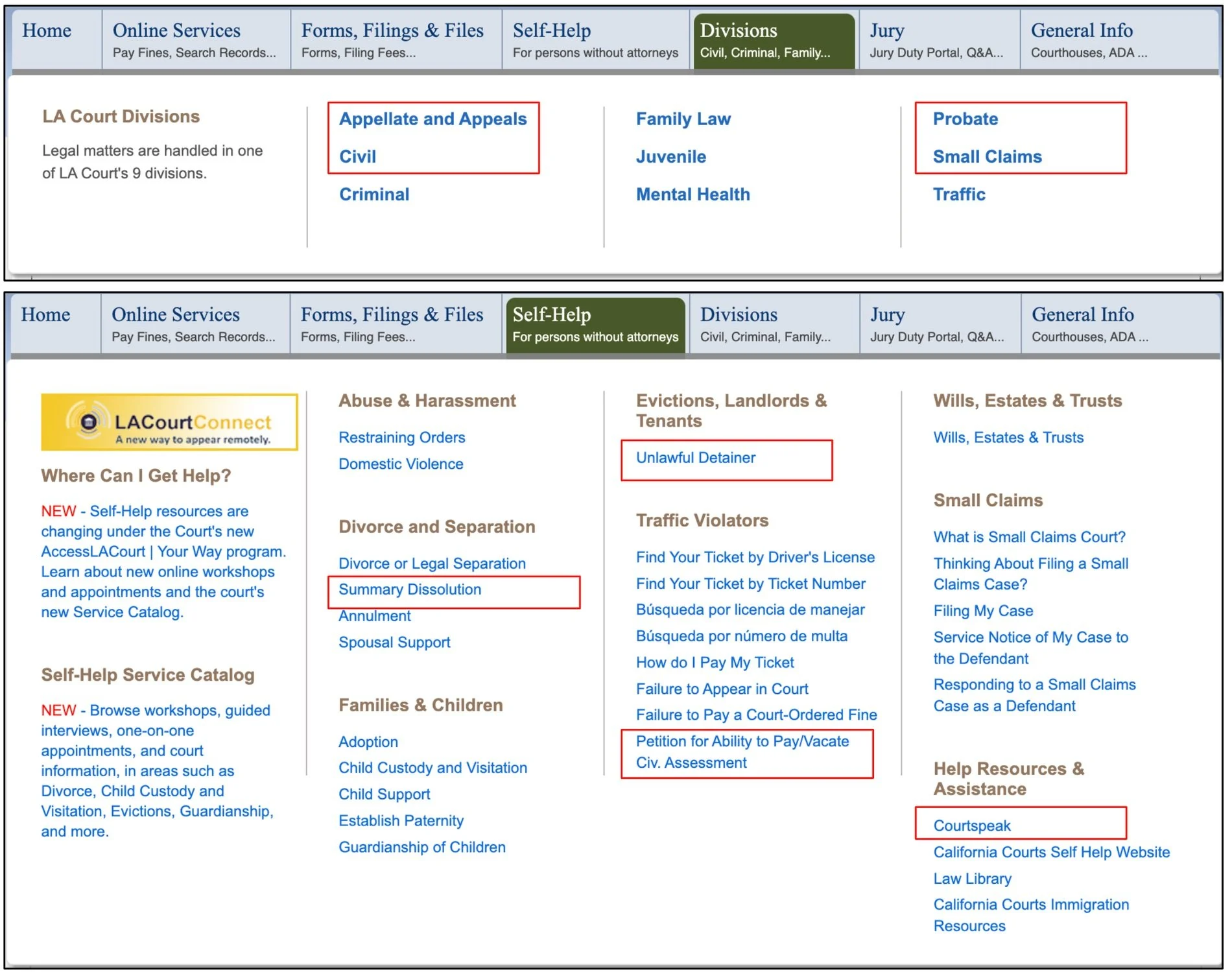
Group D
Group N
Group S
Group O
participant results screenshots
Step 4: Hueristic Evaluation
Heuristic Evaluation is a UX design method where evaluators identify usability issues by checking a user interface against established usability principles, known as heuristics. For the purpose of our project, our team utilized Jakob Nielsen's 10 Usability Heuristics.
Some key/most critical findings from the test include the following:
1. Cluttered and Overwhelming Pages:
Heuristic: Aesthetic and Minimalist Design
Severity Rating: High
Issue: Pages are overcrowded with text, presented in large blocks without sufficient headings, bullet points, or whitespace, making them overwhelming and difficult to read. Important information is buried within dense paragraphs, lacking a visual hierarchy to guide users, while redundant or irrelevant content adds to the clutter without offering additional value
Recommendation: Simplify the page layouts by reducing unnecessary content, using white space effectively, and improving the visual hierarchy to guide users' attention to the most important elements.
2. Complex Language and Legal Terminology:
Heuristic: Match Between System and the Real World
Severity Rating: High
Issue: The site uses legal terminology that may not be easily understood by the general public. This can lead to confusion and difficulty in navigating the site or understanding important information.
Recommendation: Simplify the language and provide explanations or tooltips for legal terms to make the site more accessible to non-legal users
3. Inconsistent Design:
Heuristic: Consistency and Standards
Severity Rating: Medium to High
Issue: Design formats and elements like fonts, and colors are inconsistent across different sections of the site. This inconsistency can make it harder for users to learn how to navigate the site efficiently.
Recommendation: Standardize navigation menus and design elements across the site to create a more intuitive and cohesive user experience
4. Redundant Navigation & Confusing Link Differentiation :
Heuristic: User Control & Freedom
Severity Rating: High
Issue: Users face confusion and frustration when links and buttons lead to repetitive content, with unclear distinctions between new and repeated information. Poorly structured navigation further disrupts the user journey, limiting control and causing disorientation.
Recommendation: Streamline content by consolidating redundant pages/links and optimize navigation paths to provide a cohesive and logical flow, reducing user frustration and enhancing overall control.
Redesigning Navigation & Labeling
Card Sorting Study
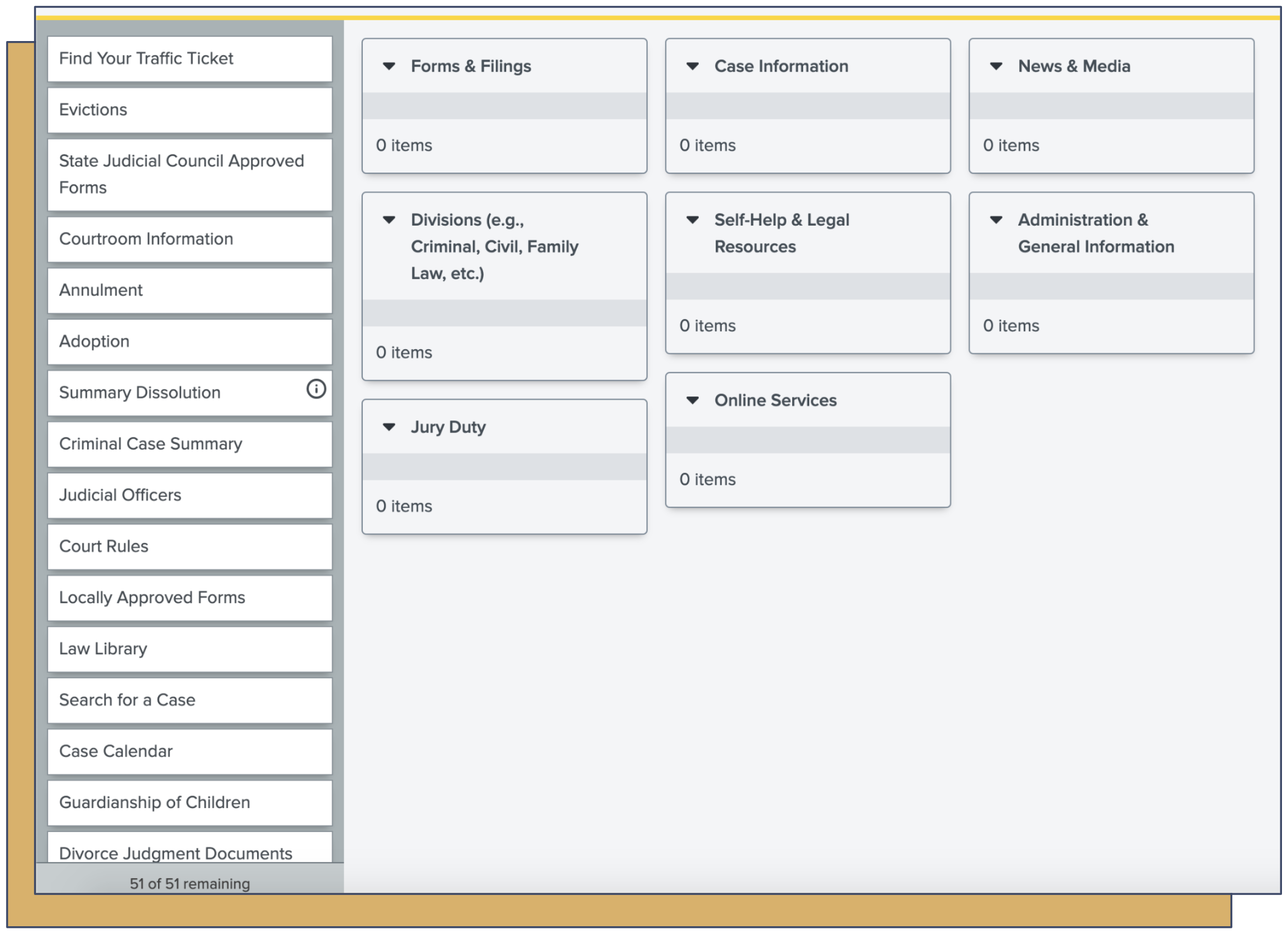
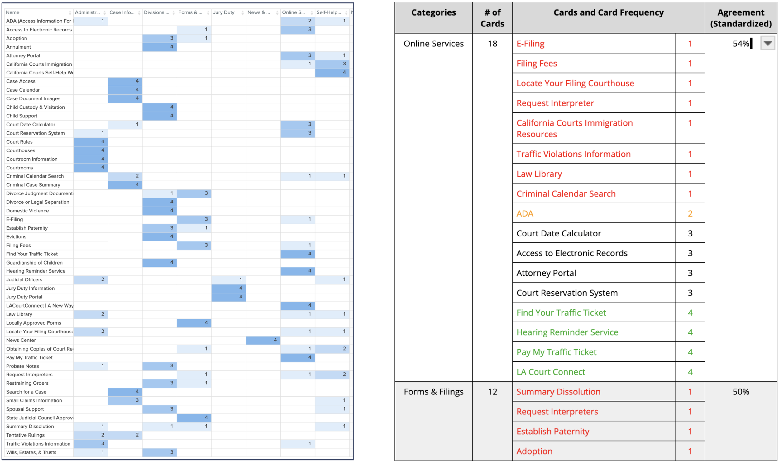
Card sorting is a usability method in which participants organize labeled cards into groups, providing insights into users' mental models and how users group and label information on a website. For the purpose of our project, our group utilized Optimal Workshop to conduct a hybrid card sort where participants could use predefined categories or create their own.
The study consisted of 6 pre-study questions, 8 predefined categories, 51 cards to be sorted, and 6 post-study questions. Overall, 4 participants completed the study.
Our team analyzed the card sorting results, focusing on key statistics like category agreement, card placement consistency, and the frequency of each card's placement within categories.
Many categories showed low to very low agreement, likely due to the limited number of participants.
Key Results & Insights:
Card sorting revealed natural groupings, e.g., "Case Information" as a subcategory under "Online Services."
For low agreement categories, we turned to competitor sites like San Bernardino Court and Orange County Court to help us understand common practices and standards in organizing legal information online
Redesigned Navigation Recommendation:
Combine nested links, consolidate buttons, and clarify labels to reduce clutter and improve understanding.
The Redesign: Version 1
New Navigation Tree
Tree Testing the Redesign
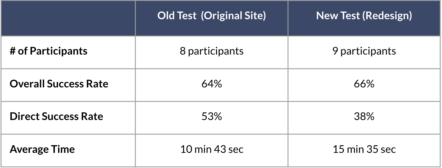
In this phase of testing the redesigned LA Court website, we're using Tree Testing to evaluate how effectively the new navigation helps users locate specific information, such as court forms, case status updates, and jury duty details. Our goal is to compare these results with those from the original tree test to determine if the redesign has improved user navigation and task completion. This comparison will help us confirm whether the changes have enhanced usability and identify any areas needing further improvement.
Key findings from the test include the following:
Improved Performance:
Jury Duty Information and Appear in Court Remotely saw significant improvements in both success and directness.
E-Filing also showed a notable increase in overall success rate and some improvement in directness.
Declined Performance:
Case Access, Traffic Violation Help, and Filing a Restraining Order had significant drops in success rates.
Family Law Resources and Interpreter Services saw a decrease in directness despite success rates either remaining high or improving.
The Redesign: Version 2
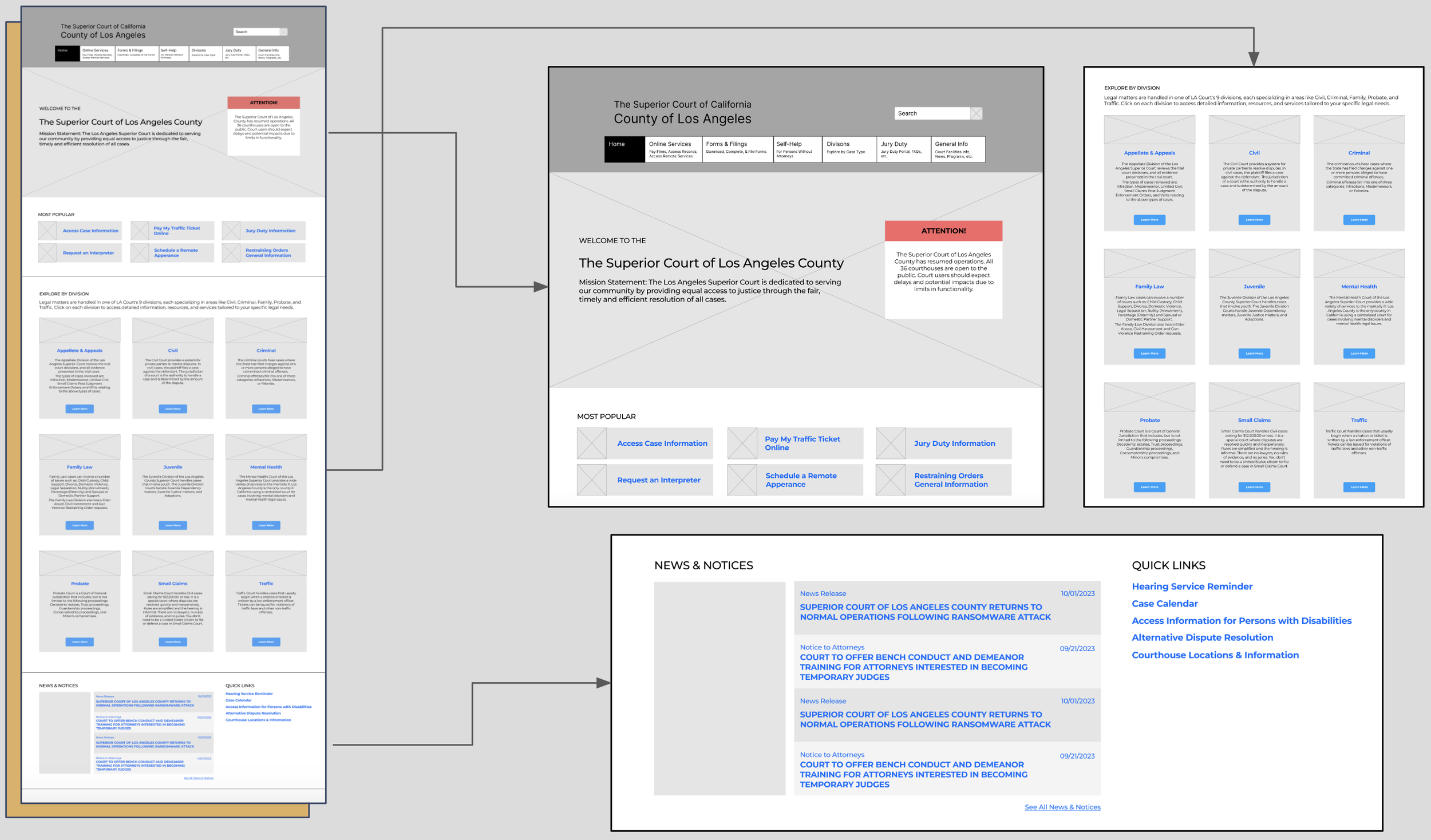
New Wireframes
First-Click Testing the Redesign
In this first-click test for the redesigned LA Court website, we assess how well the new wireframes guide users to key information. By analyzing first clicks, we aim to determine if the redesign has improved clarity and navigation compared to the original and to identify areas for further improvement.
From the results of this round of first-click testing, our team observed that only 4 tasks had less than a 100% success rate:
Case Access & Info
Traffic Ticket Info
Restraining Order Info
Courthouse Locations Info
These tasks were primarily related to finding information rather than completing an action. For these tasks, participants typically clicked first on the "Most Popular" tab or link, if available, or on "Divisions." This observation implies that users rely on familiar or prominently labeled sections, like "Most Popular" or "Divisions," when searching for information, suggesting these areas are perceived as intuitive starting points for locating content.
Final Design Recommendation
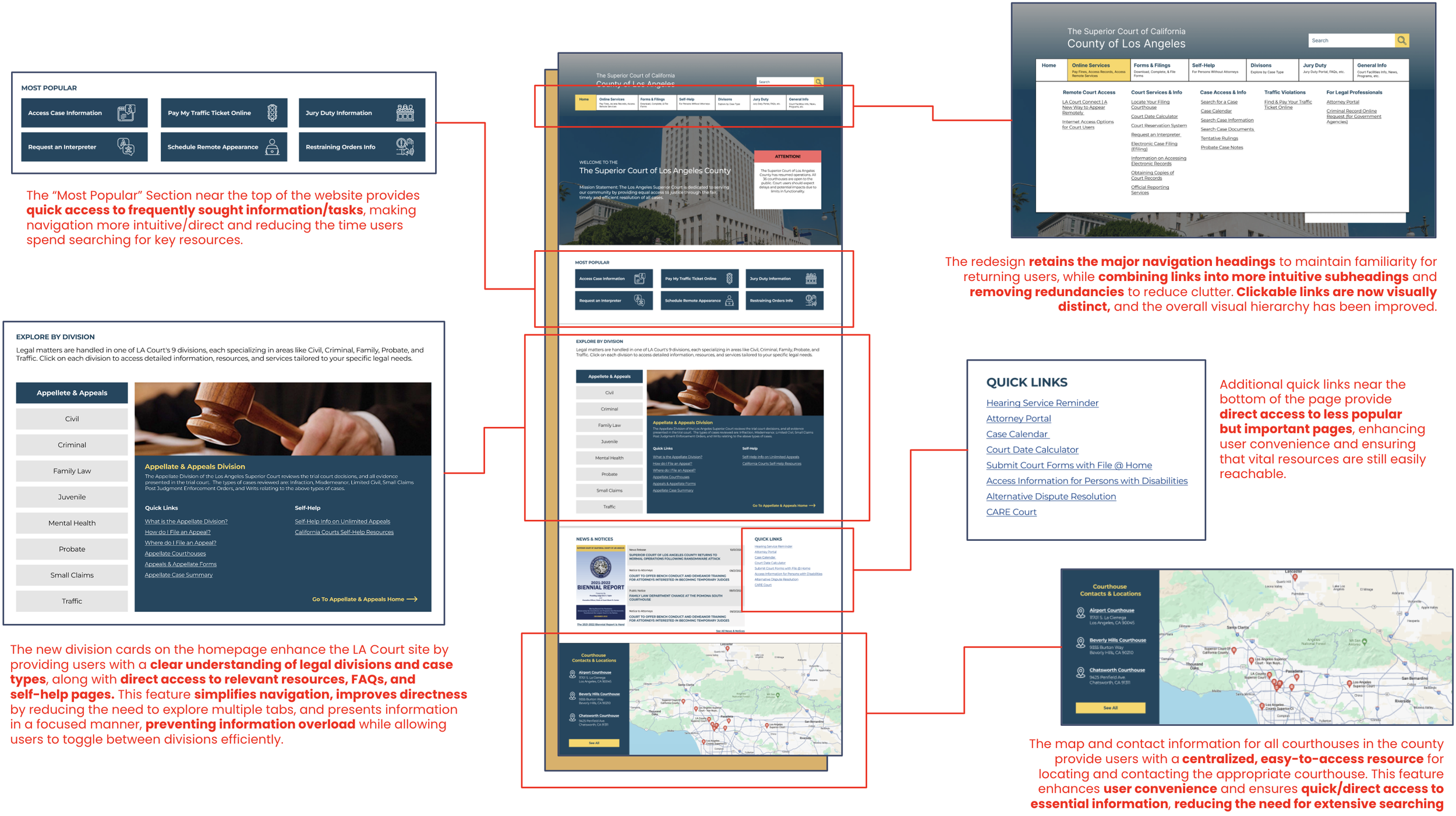
New Key Features
Comparing the Old & New LA Court
We've made significant progress throughout this redesign process. The image on the far left shows the original site, which was extremely cluttered and suffered from severe information overload.
The middle image displays our initial redesign before the second round of user testing. While this version is much cleaner than the original, it still has some text-heavy elements and relies on multiple layers of navigation to access specific resources.
The final redesign, shown on the far right, further reduces information overload and offers more direct pathways to key resources, making the site more user-friendly and accessible.
The images on the left compare the old and new main navigation. Redundant buttons have been removed, and items have been consolidated. While the redesign still includes many links, it is significantly less cluttered than the original site, providing a cleaner and more streamlined user experience.
Final Interactive Prototype
Conclusion & Reflection
The redesign efforts for the LA Court website were focused on the home page and main navigation due to a combination of the site's extensive and dense structure and limited time.
The redesigned website shows clear improvements in task success rates, task completion times, and user satisfaction, indicating that the redesign was successful
The average success rate for the original design is 73.8%, compared to 92.9% for the redesign.
The average time taken to complete tasks in the original design is 11.22 seconds, while the redesign's average time is 9.41 seconds.
User testing, research-driven insights, and iterative redesign efforts were crucial in driving the enhancements made to the LA Court website. Through multiple rounds of user testing, we were able to identify key pain points, such as information overload and poorly structured navigation, that directly impacted user experience. Research-driven insights, based on analyzing usability metrics and user behavior, informed design decisions that improved the clarity and functionality of the site. Iterative redesigns allowed us to continuously refine and optimize the interface, ensuring that each change was rooted in data and directly addressed user needs, leading to a more intuitive and user-friendly website.
Next Steps:
Conduct further research and testing to address remaining issues and explore additional features that could enhance the user experience. This includes conducting another round of first-click testing on the latest version of the redesign that was implemented to improve upon the findings from Round 2 of first click-testing.
Broaden user testing to include a more diverse user base to ensure the redesign meets the needs of all users.
Expand redesign efforts to all sections of the site to reduce clutter and complexities across all pages.

